This article was updated November 6, 2019.
Here at WP Creator’s Club, we have a few plugins that extend the functionality of the Divi Contact Form module, such as our Divi Date/Time Picker and our Divi Multistep Contact Form plugin.
Sometimes though we take on projects for clients that need more functionality than the Divi Contact Form module can handle.
That’s when we turn to the awesome Caldera Forms plugin.
I was recently working on a project for a client where we were using the Caldera Forms plugin and out of the box, the form is left pretty much unstyled, allowing the designer to style the form however they’d like.
Since we use Divi for a lot of our client projects, I wanted the Caldera forms to match the rest of the site – in particular some simple Divi Contact Forms we were using else where on the site.
The following is the CSS I wrote to get the Caldera Forms fields to look like the Divi Contact Form module fields:
.caldera-grid input.form-control,
.caldera-grid select.form-control,
.caldera-grid textarea.form-control {
	box-sizing: border-box;
    -moz-box-sizing: border-box;
    -webkit-box-sizing: border-box;
    background-color: #eee;
	border: 0;
	border-width: 0;
    -webkit-border-radius: 0;
    -moz-border-radius: 0;
    border-radius: 0;
	box-shadow: none;
	color: #999;
	font-size: 14px;
	height: auto;
    padding: 16px;
}

.caldera-grid select.form-control {height:51px}

.caldera-grid .checkbox input[type="checkbox"],
.caldera-grid .radio input[type="radio"] {
	-webkit-appearance: none;
    -moz-appearance: none;
    appearance: none;
	background-color: #eee;
	border: 0;
	border-width: 0;
	height: 18px;
	width: 18px;
	position: relative;
	vertical-align: middle;
	margin-top:-1px;
}

.caldera-grid .radio input[type="radio"] {border-radius:50%}

.caldera-grid .checkbox input[type="checkbox"]:checked::before,
.caldera-grid .radio input[type="radio"]:checked::before {
    position: absolute;
    top: 50%;
    left: 50%;
    content: "";
    transform: translate(-50%,-50%);
}

.caldera-grid .checkbox input[type="checkbox"]:checked::before {
	width: 17px;
    height: 17px;
    color: #2ea3f2;
    font-family: dashicons;
    font-size: 17px;
    line-height: 17px;
    content: "\f147";
}

.caldera-grid .radio input[type="radio"]:checked::before {
	width: 6px;
    height: 6px;
    border-radius: 50%;
    background: #2ea3f2;
}

.caldera-grid input:focus,
.caldera-grid textarea:focus,
.caldera-grid .checkbox input[type="checkbox"]:focus {
  outline-style:none !important;
  box-shadow:none !important;
  border-color:transparent !important;
}
The above CSS code should cover all of the input fields Caldera uses, including:
- Normal text inputs (including email, password, phone, date, etc)
- textarea
- select
- checkboxes
- radio boxes
The problem (and solution) to the submit button
Matching up the buttons in Caldera is a little different but it’s actually pretty easy because we’re going to rely on some of Divi’s built in CSS classes to handle the heavy lifting for us, with a few modifications.
However, we do run into a slight obstacle here.
Divi uses CSS pseudo elements to display button icons. Divi can do this because their buttons are actually using the <button> tag.
On the other hand, Caldera takes a different approach and uses an <input> tag for it’s button and <input> tags cannot use pseudo elements in CSS.
This means that out of the box, the submit buttons in Caldera cannot perfectly mimic Divi’s contact form buttons because they can’t use pseudo elements to display the icon.
But we have a work around.
First, add the following CSS to your stylesheet below the CSS you copied above:
.caldera_divi_contact_button {
	display: inline-flex;
	position: relative;
}

.caldera_divi_contact_button::after {
	right: 1em;
}

.caldera_divi_contact_hide_button {
	-webkit-appearance: none;
    -moz-appearance: none;
    appearance: none;
	background-color: inherit;
	border: 0;
	border-width:0;
	color: inherit;
}
Basically what we’re doing with this block of CSS is adjusting where the button icon gets displayed and telling the browser not to render Caldera’s button styles because we’re going to do some CSS trickery.
We’re going to apply Divi’s button styles to the <div> holding Caldera’s <input> submit button and make it look like the submit button.
When users click it, the user-experience will be identical to Divi’s submit button, however, it will be a <div> element visible and the actual submit button will just be transparently (for the most part) sitting on top accepting the click action.
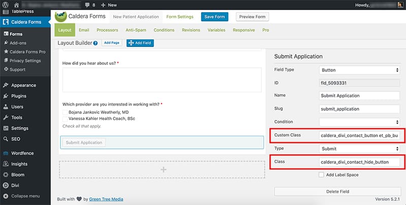
Now we just need to add our classes to Caldera’s button.

When editing the submit button, in the Custom Class field, add the following 2 classes:
- caldera_divi_contact_button
- et_pb_button
These will apply Divi’s button styles to the <div> holding the submit button.
Next, in the field marked Class, remove the existing classes and add the class caldera_divi_contact_hide_button – this class introduces the CSS preventing the normal Caldera styles from being applied to the actual button so our Divi button styles can show through.
Wrapping Up
That’s pretty much all there is to it. By tackling the submit button this way, it should match the button styles even if you change them down the road in the Theme Customizer, making your Caldera Forms a bit more ‘future Divi-proof.’
If you have other tips and tricks when it comes to Caldera Forms and Divi, drop them in the comments!

