Adding testimonials and reviews to a website is a great way to demonstrate social proof for your product or service.
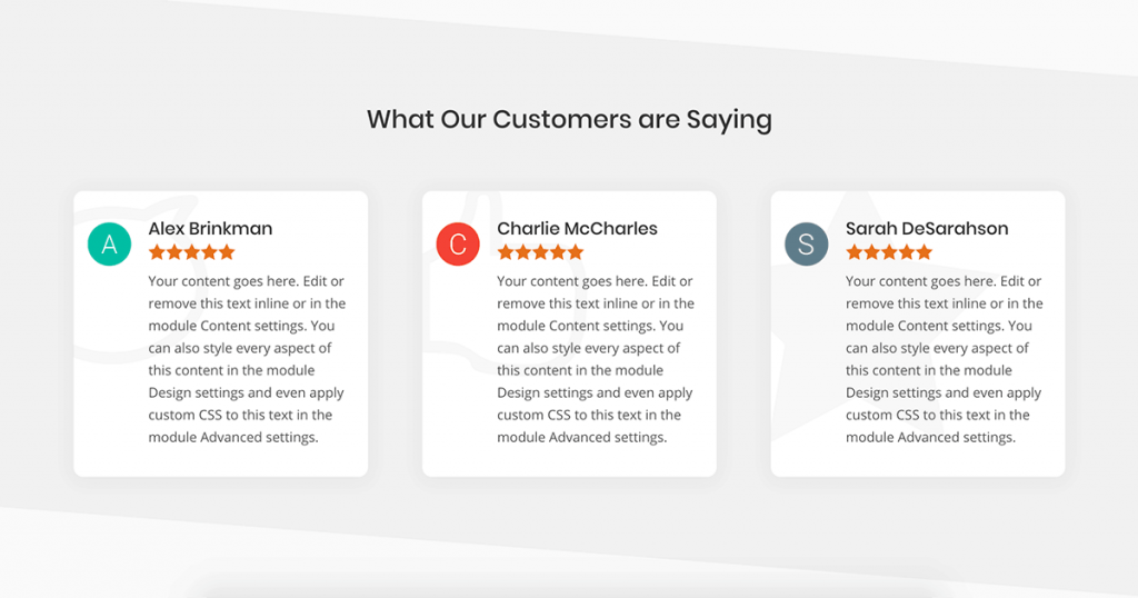
Today I want to show you how you can turn Divi’s native Blurb module into a sleek and modern review box that is similar to a Google Review using pure CSS.
Design Resources
As I mentioned in the video, there are a few resources I want to share with you that can help your design really stand out.
The first is an article from Elegant Themes that lists the unicodes for the icon font that comes shipped with Divi.
I use these icons in a lot of my designs when I’m building client websites because they’re reliable – I know they’re not going anywhere and will continue to be part of the Divi core. This also means I know the icons are going to match everything else on the site.
The second is the Material Design letters I used in the video.
I think adding a thumbnail of something next to a review is a great way to add some credibility to the review and make it feel more authentic.
When I see reviews of just text and a name, it just doesn’t have the same legitimacy as a review that has some sort of profile image, even if it’s just a letter. Maybe it’s just me that feels that way. Who can say.
Divi CSS Snippets
Below you’ll find the CSS snippets used in the video.
5 Star CSS
.customer_review_blurb .et_pb_module_header::after {
  color: #e7711b;
  content:'\e033\e033\e033\e033\e033';
  display: block;
  font-family:'ETmodules';
  margin: 5px 0 0;
}
Copy the above CSS to your child theme’s stylesheet or in the Custom CSS tab for the entire page as I did in the video. Don’t put this CSS in your blurb module. That code comes next.
Remember, when copying icon unicodes, we only need what comes after the &#x and it MUST be prefixed with a slash – this is a deal breaker if you forget it.
In the example above, we just need e033 for our filled in stars.
Blurb Background Icon CSS
content:'\e106';
font-family:'ETmodules';
position:absolute;
top: 50px;
left: 0;
font-size:200px;
opacity:0.075;
Copy and paste this block of CSS code into the Before custom CSS block.
It’s also very important that in the Main Element CSS block, you write the following:
position:relative;This will prevent parts of your background icon from displaying outside of the blurb module.
Wrapping Up
Once you have those CSS elements in place feel free to get creative designing the rest of the testimonial element using Divi’s built in editor.
With all of those icon choices you’re really only limited by your imagination.
Have a question about something I covered (or something I missed?) feel free to drop it in the comments below.
Happy designing!
