Often times when creating a form on a website we need to give our users the ability to select from a few predefined options. This is where checkbox and radio inputs come in really handy.
The trouble is that sometimes these inputs just look… boring.
Never fear! Here is a quick and simple CSS snippet you can use to turn these boring old checkbox and radio inputs into beautiful buttons that actually make your form look more user-friendly and modern.
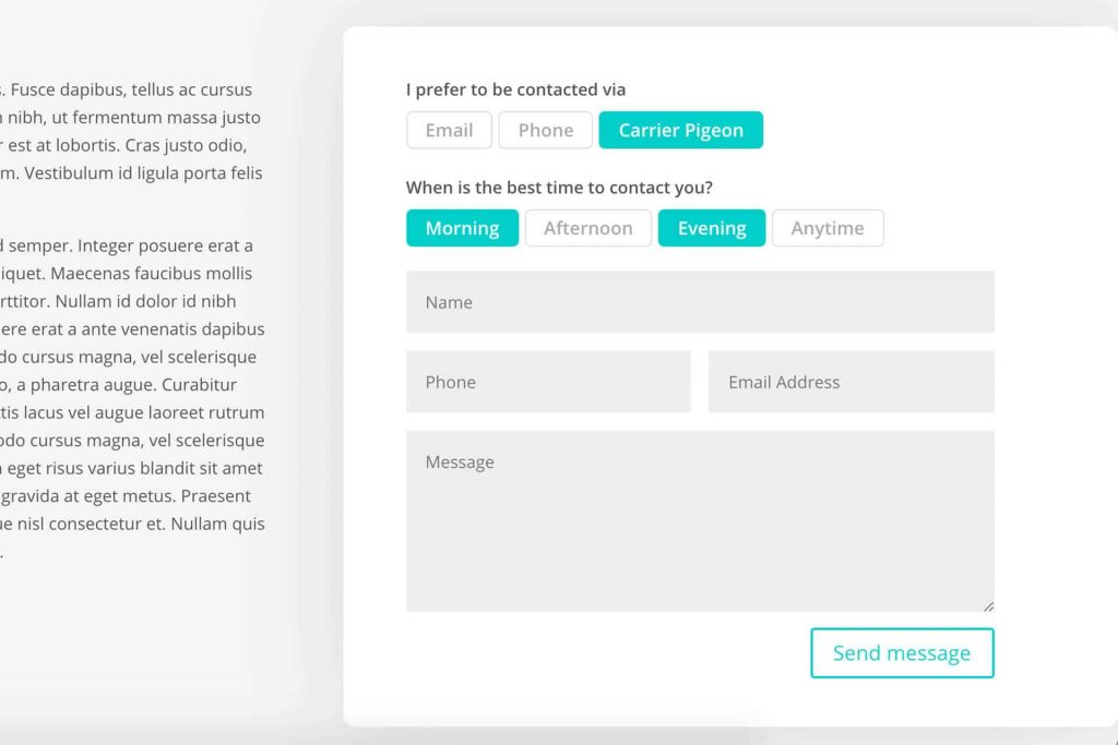
The code below will affect BOTH checkboxes and radio inputs so feel free to use both types of inputs in your forms.
Be sure to give your contact form module a custom class. The code below assumes you’ve given your contact form module a custom class of checkbox_radio_button_wpcc but feel free to change as desired.
I’ve left comments in explaining the code if you want to make changes to match your style and theme.
.checkbox_radio_button_wpcc .et_pb_contact_field_checkbox,
.checkbox_radio_button_wpcc .et_pb_contact_field_radio {
  display: inline-block; /* comment this out if you want buttons to lined up vertically */
}

/* This block hides the input fields. */
.checkbox_radio_button_wpcc .et_pb_contact_field_checkbox i,
.checkbox_radio_button_wpcc .et_pb_contact_field_radio i {
  position: absolute;
  visibility: hidden !important;
  display: none !important;
}

/* Now we make the label the button. Style accordingly. */
.checkbox_radio_button_wpcc .et_pb_contact_field_checkbox label,
.checkbox_radio_button_wpcc .et_pb_contact_field_radio label {
  border: 1px solid;
  border-color: #ddd;
  border-radius: 5px;
  color: #aaa;
  display: inline-block;
  cursor: pointer;
  font-weight: bold;
  font-size: 16px !important;
  line-height: 1em !important;
  max-width: 100%;
  padding: 10px;
  margin: 0 5px 5px 0 !important;
  transition: all ease .3s;
}

/* Button styles when hovered. */
.checkbox_radio_button_wpcc .et_pb_contact_field_checkbox label:hover,
.checkbox_radio_button_wpcc .et_pb_contact_field_radio label:hover {
  background-color: transparent;
  border-color: #00cec9;
  color: #00cec9;
  cursor:pointer;
}

/* Button styles when checked. */
.checkbox_radio_button_wpcc .et_pb_contact_field_radio input[type=radio]:checked + label,
.checkbox_radio_button_wpcc .et_pb_contact_field_checkbox input[type=checkbox]:checked + label {
  color: #fff;
  background: #00cec9;
  border-color: #00cec9;
}
If you have any questions about implementing the code or extending it further, I’d love to talk about it!
Drop your thoughts in the comments below and happy designing!
